
Step into the fascinating world of color as we explore the science behind choosing the perfect palette for your art prints. In this article, we will uncover the secrets of how colors evoke emotions, convey messages, and create visual harmony. Discover the power of color psychology, the interplay of hue, saturation, and value, and unlock your artistic potential by understanding the impact of different color combinations. Whether you are a seasoned artist or just starting out, this guide will help you unleash the full potential of your artwork by mastering the art of color selection.
Understanding Color Theory
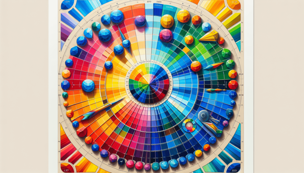
Color theory is essential for artists and designers alike. By understanding the principles of color and how they interact with each other, you can create visually appealing and harmonious art prints. The color wheel is a fundamental tool in color theory, as it showcases the relationships between different colors. It consists of primary colors (red, blue, and yellow), secondary colors (orange, green, and purple), and tertiary colors (created by mixing primary and secondary colors). These colors form the basis of any color palette.
The Color Wheel and Color Relationships
The color wheel is not just a visual representation of colors; it also demonstrates the relationships between colors. There are several color relationships to understand, such as complementary colors, which are located opposite each other on the color wheel. Pairing complementary colors in your art prints creates a vibrant and dynamic effect. On the other hand, analogous colors are located next to each other on the color wheel and create a harmonious and soothing visual experience.
Primary, Secondary, and Tertiary Colors
Primary colors are the foundation of any color palette because they cannot be created by mixing other colors. These colors are red, blue, and yellow. Secondary colors, such as orange, green, and purple, are created by mixing two primary colors. Tertiary colors, on the other hand, are made by mixing a primary color with a secondary color. Understanding these color relationships will help you create a well-balanced and visually pleasing color scheme for your art prints.
The Concept of Color Harmonies
Color harmonies refer to the combination of colors that are aesthetically pleasing to the eye. The most common color harmonies are complementary, analogous, split-complementary, triadic, and tetradic color schemes. Complementary color schemes involve using colors that are opposite each other on the color wheel. Analogous color schemes use colors that are adjacent to each other, creating a harmonious and cohesive look. Split-complementary schemes involve choosing a base color and combining it with the two colors adjacent to its complementary color. Triadic color schemes use three colors that are evenly spaced on the color wheel, while tetradic schemes use four colors in a square or rectangle formation. Experimenting with these color harmonies will help you create different moods and atmospheres in your art prints.
Importance of Contrast and Balance in Color
Contrast and balance play a crucial role in creating visually appealing art prints. Contrast refers to the difference in values, hues, and intensities between colors. By using contrasting colors, you can create a sense of depth and visual interest in your prints. Balance, on the other hand, ensures that no single color overwhelms the composition. It is important to create a balance between warm and cool colors, as well as dark and light tones, to maintain a harmonious and balanced color palette.
Psychological Impact of Colors
Colors have the power to evoke specific emotions and create different psychological responses. Understanding the emotional impact of colors can help you convey the desired mood and message in your art prints. For example, warm colors like red, orange, and yellow are often associated with energy, passion, and happiness. On the other hand, cool colors like blue, green, and purple evoke a sense of calmness, tranquility, and relaxation. By choosing the right colors based on their psychological impact, you can effectively communicate with your audience through your art prints.
Common Cultural Interpretations of Colors
Colors can also have cultural significance and interpretations. Different cultures may associate certain colors with specific meanings. For example, in Western cultures, white is often associated with purity and innocence, while in some Eastern cultures, it symbolizes mourning and death. Red is seen as lucky and auspicious in many Asian cultures, whereas in Western cultures, it often represents love and passion. Understanding the cultural interpretations of colors can help you connect with different audiences and create art prints that resonate with their cultural background.
Industrial Psychology Approach to Color Choices
The field of industrial psychology also recognizes the importance of color in influencing human behavior and perception. In commercial settings, color choices are carefully considered to create an environment that enhances productivity, promotes relaxation, or stimulates appetite, among other things. By applying the principles of industrial psychology to your color choices in art prints, you can effectively engage viewers and elicit specific emotional responses.
Color Schemes in Art
Different color schemes have different effects on the overall aesthetic and message of an art print. Monochromatic color schemes involve using variations of a single color, creating a cohesive and harmonious look. Analogous color schemes use colors that are adjacent to each other on the color wheel, resulting in a harmonious, balanced, and soothing composition. Complementary color schemes involve pairing colors that are opposite each other on the color wheel, creating a visually striking and dynamic effect. Split-complementary color schemes are similar to complementary schemes but involve using the two colors adjacent to the complementary color. Triadic color schemes use three equally spaced colors on the color wheel to create a balanced and vibrant composition. Tetradic color schemes involve using four colors in a square or rectangle formation for a visually exciting and dynamic result.
Application of Color Theory in Art Prints
Understanding color theory is essential in creating visually appealing art prints. The choice and combination of colors can significantly impact the overall visual appeal of your prints. By considering color relationships, such as complementary or analogous colors, you can create a harmonious and balanced color scheme that enhances the themes and messages portrayed in your artwork. It is also important to experiment with different color schemes to find the best fit for each individual print. By incorporating the principles of color theory in your art prints, you can effectively engage viewers and create a captivating visual experience.
Influence of Art Style on Color Palette
Different art styles often utilize specific color palettes to achieve their desired aesthetic and convey their intended message. Realism art, for example, aims to depict objects and scenes as accurately as possible, often using a natural color palette that mirrors real-life colors. On the other hand, impressionism art focuses on capturing the essence of a scene and utilizes vibrant and contrasting colors to create an impression of the subject. Expressionism art often employs bold and vibrant colors to convey emotions and subjective experiences. Modern and postmodern art movements have embraced a wide range of color palettes, often pushing boundaries and exploring unconventional combinations. By understanding the color palettes associated with different art styles, you can effectively convey the intended style and message in your art prints.
The Role of Lighting on Colors
Lighting plays a crucial role in how colors are perceived. Natural light can significantly affect the appearance of colors, as the intensity and temperature of sunlight change throughout the day. It is important to consider the lighting conditions in which your art prints will be viewed to ensure that the colors appear as intended. Similarly, room lighting can impact the colors in your art prints. Different types of artificial lighting, such as incandescent, fluorescent, and LED lights, can create different color temperatures and tones. Taking into account the lighting conditions under which your prints will be displayed can help you make informed color choices and ensure that the desired visual impact is achieved.
Suitability of Colors for Different Spaces
The choice of colors for art prints may vary depending on the space in which they will be displayed. In residential spaces, personal preferences and the desired atmosphere play a significant role in color selection. Calm and soothing colors are often preferred for bedrooms and relaxation areas, while vibrant and energizing colors may be more suitable for living areas and recreational spaces. In commercial spaces, color choices are influenced by factors such as branding, target audience, and the desired emotional response. For example, restaurants may opt for warm colors to stimulate appetite, while healthcare facilities may choose soft and calming colors to promote relaxation. Understanding the different considerations for residential and commercial spaces can help you create art prints that effectively resonate with the environment in which they will be displayed.
Consideration of Print Formats
Different print formats, such as framed prints or canvas prints, can influence how colors are perceived. When choosing colors for framed prints, it is essential to consider how the frame and matting will interact with the artwork. The color of the frame can either complement or contrast with the colors in the print, enhancing the overall visual impact. Canvas prints offer a different texture and presentation, with colors often appearing more vibrant and textured. The texture of the canvas can further enhance the tactile experience of the artwork and impact how colors are perceived. When selecting colors for different print formats, it is important to consider how these factors will interact and contribute to the overall aesthetic.
The Influence of Trending Colors on Art Prints
Color trends evolve over time and can have a significant impact on the popularity and sales of art prints. Staying updated with current color trends can help you create prints that align with current consumer preferences and demands. Incorporating trending colors in your art prints can attract a wider audience and increase the potential for sales. However, it is important to balance trendy colors with timeless colors to ensure longevity and appeal beyond the current trend. By finding the right balance between trending hues and enduring colors, you can create art prints that are both current and timeless.
Practical Tips for Mixing and Matching Colors
Mixing and matching colors can be a complex task, but with some practical tips, you can achieve the desired color palette for your art prints. Understanding color values, which refers to the lightness or darkness of a color, can help you create contrast and depth in your prints. Additionally, considering color intensities, which refers to the brightness or dullness of a color, allows you to create visual interest and highlight focal points. Testing different color combinations and observing them in various lighting conditions can help you finalize your color palettes. Adjusting color balance and saturation can also ensure that the desired output is achieved, enhancing the overall visual impact of your art prints.
In conclusion, understanding color theory is essential for creating visually appealing and harmonious art prints. By considering the color wheel, color relationships, and different color harmonies, you can effectively choose and combine colors to convey the desired mood and message in your prints. The psychological impact and cultural interpretations of colors further enhance the emotional connection between the viewer and your artwork. The choice of color palette can also be influenced by different art styles and art movements, as well as the role of lighting and the suitability of colors for different spaces. Considering print formats and staying updated with color trends can further enhance the visual appeal and marketability of your art prints. By applying practical tips for mixing and matching colors, you can create art prints that engage viewers, evoke emotions, and leave a lasting impression.